Dashboards
A dashboard is one YAML file that holds the connection, the filters, the queries, and
the tiles. Here is a trimmed version of the demo that sqldash init --demo writes.
title: Order Analytics
description: Demo dashboard over a local CSV. Swap the source for your warehouse.

source: {type: duckdb, attach_files: true}

filters:
  - {name: dates, type: daterange, label: Date range, default: last_60_days}
  - name: region
    type: select
    label: Region
    options_sql: "SELECT DISTINCT region FROM orders ORDER BY region"

tiles:
  - title: Total revenue
    metric: revenue
    size: 6x2
    compare: previous_period

  - title: Revenue by category
    chart: bar
    format: currency
    size: 6x4
    sql: |
      SELECT category, ROUND(SUM(amount), 2) AS revenue
      FROM orders
      WHERE order_date BETWEEN {{ dates_start }} AND {{ dates_end }}
        {% if region %}AND region = {{ region }}{% endif %}
      GROUP BY 1
      ORDER BY 2 DESC

  - size: 12x2
    markdown: |
      **This whole dashboard is one YAML file.**
Dashboard files live in .sqldash/ at the root of a repo, which is what init
creates. You can also serve a single file directly with sqldash serve report.yaml.
Every dashboard file in .sqldash/ shows up in the dashboard picker.
The top of the file
| key | what it does |
|---|---|
title |
Required. The name shown in the picker and at the top of the page. |
description |
A line of context under the title. |
source |
The connection, or several named connections. See Sources. |
filters |
Controls at the top of the page that feed values into queries. |
tiles |
Everything on the grid, in order. |
queries |
Named SQL that several tiles can share. |
metrics, relations |
Metrics defined inside this dashboard, so a single file stays portable. |
layout |
Grid settings, such as row_height in pixels. |
refresh |
Re-runs every tile on an interval, such as 30s, 5m, or 1h. |
currency, locale |
Defaults for number formatting. |
css |
A theme for this dashboard. See Themes. |
Unknown keys are errors with a did-you-mean hint, so a typo never fails silently.
Tiles
A tile shows either data or text. A data tile gets its data from exactly one place, and the three ways look like this.
tiles:
  # 1. a governed metric from metrics.yaml
  - title: Revenue by month
    metric: {name: revenue, grain: month, dimensions: [region]}
    chart: {type: line, group_by: region}

  # 2. inline SQL
  - title: Largest orders
    chart: table
    sql: |
      SELECT order_date, region, amount
      FROM orders
      ORDER BY amount DESC
      LIMIT 20

  # 3. a named query shared with other tiles
  - title: Orders by region
    query: orders_by_region
    chart: bar

queries:
  orders_by_region: |
    SELECT region, COUNT(*) AS orders FROM orders GROUP BY 1
Use a metric whenever one exists. The tile then inherits the metric’s definition and format, respects its allowed dimensions, and stays in step with the CLI and agents. Use inline SQL for one-off views, and a named query when several tiles need the same result.
A text tile is just a markdown: key, useful for headings, notes, and links.
  - size: 12x1
    markdown: |
      ### Revenue
      Figures are in USD and exclude refunds. [Metric definitions](https://example.com)
Every tile key
| key | what it does |
|---|---|
title |
The tile’s heading. Also used to derive its id. |
id |
A stable name for the tile. Set it when a theme rule or an agent refers to the tile. |
metric, sql, query |
Where the data comes from. Exactly one. |
grain |
The time grain for a metric tile, such as day or month. |
compare |
previous_ or yoy on a metric tile. See below. |
chart |
How to draw the result. See below. |
format |
How to format numbers. See below. |
source |
Which named connection to run against, when the dashboard has several. |
size, position |
Where the tile sits on the grid. See below. |
markdown |
Text for a text tile. |
Charts
A data tile draws its result with chart:. There are seven chart types. A tile without
chart: shows its result as a table.
How sqldash picks the columns
You rarely need to say which column goes on which axis. For line, area, bar, and scatter charts, sqldash reads the result’s columns and fills in what you leave out.
- The x axis is the first date or time column. If there is none, it is the first text column, and failing that the first column.
- The values are every number column except the x axis and the
group_bycolumn. - A pie takes its slice labels from the first text column and its sizes from the first number column.
- A big number shows the first number column.
If you name a column the result does not have, sqldash ignores that setting and falls back to these rules instead of drawing an empty chart.
Line
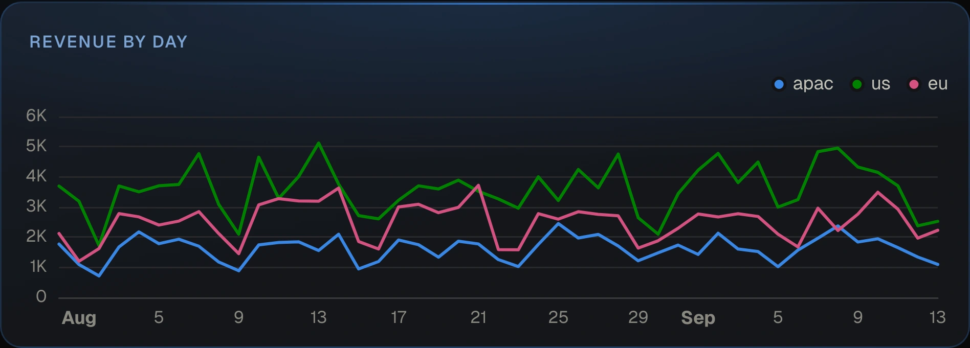
Use a line for a value over time. One number column gives one line. Add group_by to
draw a line for each value of another column.
- title: Revenue by day
  chart: {type: line, group_by: region}
  sql: |
    SELECT order_date, region, ROUND(SUM(amount), 2) AS revenue
    FROM orders GROUP BY 1, 2 ORDER BY 1
With group_by, the query returns one row per date and group, and sqldash turns each
group into its own series. The legend appears whenever there are two or more series.
Area
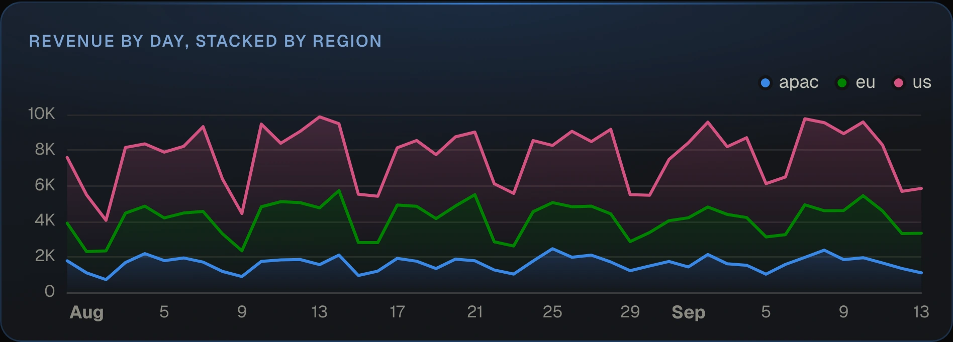
An area chart is a line chart with the space underneath filled in. Area series always stack, so the top edge shows the total and each band shows its share of it.
- title: Revenue by day, stacked by region
  chart: {type: area, group_by: region}
  sql: |
    SELECT order_date, region, ROUND(SUM(amount), 2) AS revenue
    FROM orders GROUP BY 1, 2 ORDER BY 1
Bar
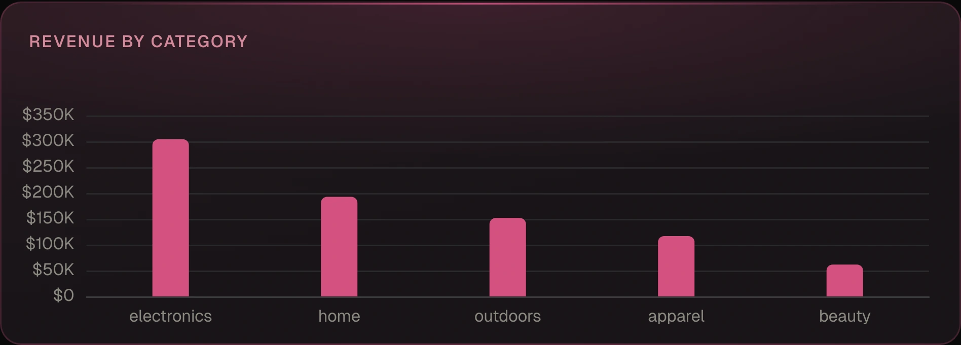
Use bars to compare categories. The order of the bars follows the order of the rows, so sort in SQL.
- title: Revenue by category
  chart: bar
  format: currency
  sql: SELECT category, ROUND(SUM(amount), 2) AS revenue FROM orders GROUP BY 1 ORDER BY 2 DESC
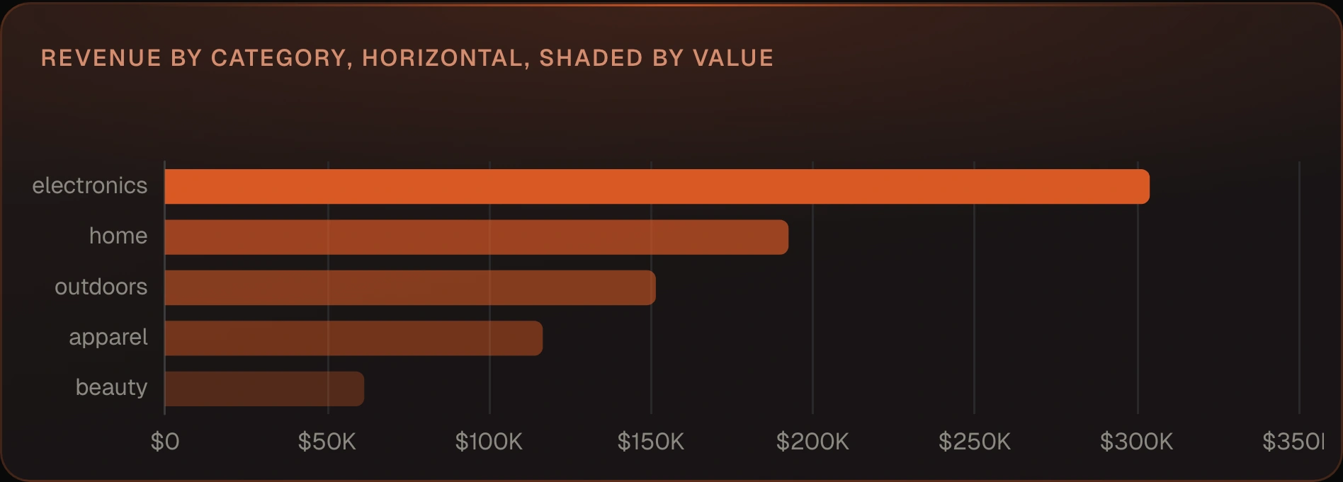
orientation: horizontal turns the bars sideways, which helps with long labels.
color_by: value shades a single series from light to dark by size.
- title: Revenue by category
  chart: {type: bar, orientation: horizontal, color_by: value}
  format: currency
  sql: SELECT category, ROUND(SUM(amount), 2) AS revenue FROM orders GROUP BY 1 ORDER BY 2
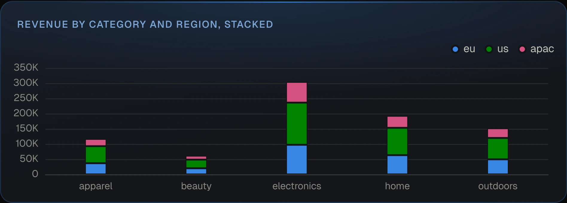
group_by splits each bar into a series per group. Bars sit side by side unless you
add stacked: true.
- title: Revenue by category and region
  chart: {type: bar, group_by: region, stacked: true}
  sql: SELECT category, region, ROUND(SUM(amount), 2) AS revenue FROM orders GROUP BY 1, 2
A bar chart with a date on the x axis draws one bar per date.
Scatter
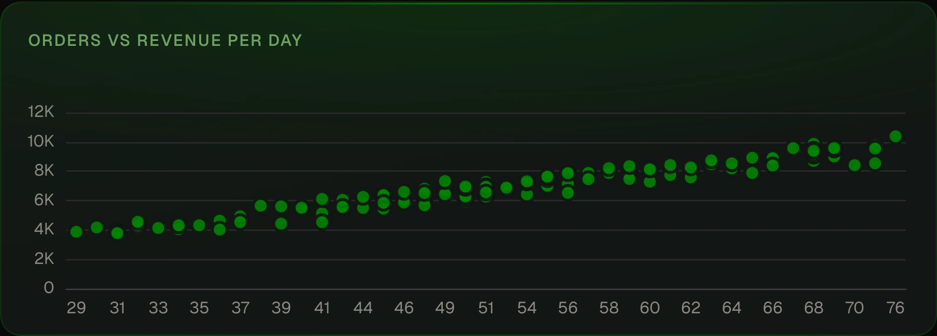
A scatter plots one number against another, one dot per row. Name both axes, because two number columns are otherwise both treated as values. The x values are drawn in row order, so sort by the x column.
- title: Orders vs revenue per day
  chart: {type: scatter, x: orders, y: revenue}
  sql: |
    SELECT COUNT(*) AS orders, ROUND(SUM(amount), 2) AS revenue
    FROM orders GROUP BY order_date ORDER BY orders
Pie
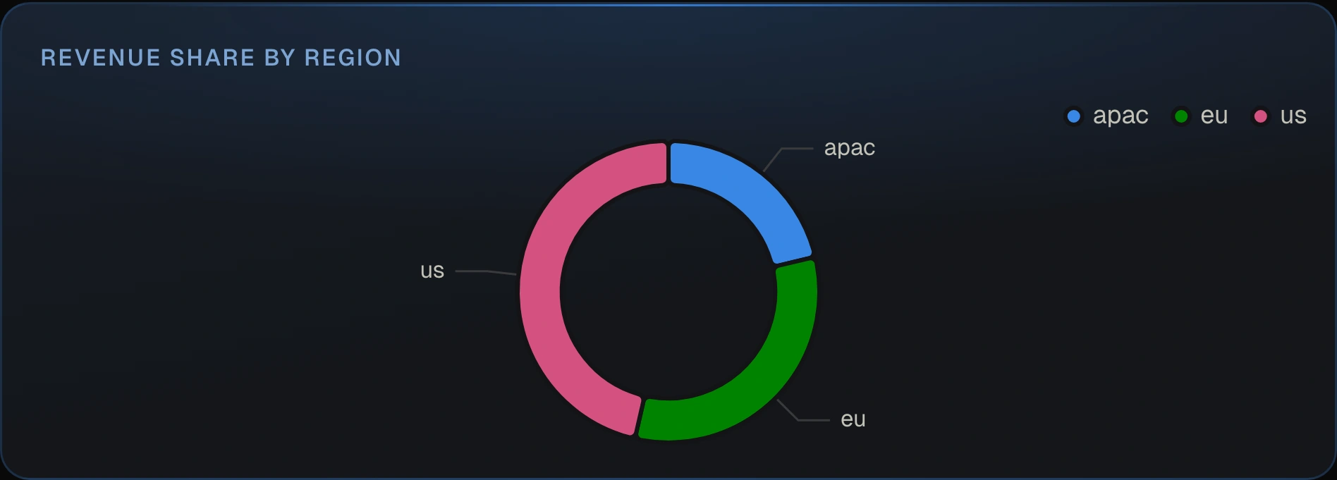
A pie shows each row’s share of the total, drawn as a donut. It needs one label column and one number column. Keep it to a handful of slices.
- title: Revenue share by region
  chart: pie
  format: currency
  sql: SELECT region, ROUND(SUM(amount), 2) AS revenue FROM orders GROUP BY 1
Set label and value to pick the columns yourself.
Big number
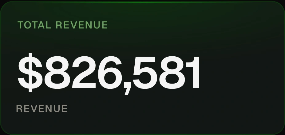
A big number shows a single value from the first row, with the column name underneath.
It suits totals and headline metrics. On a metric tile, add compare: to show the
change from the previous period.
- title: Total revenue
  chart: big_number
  format: currency
  sql: SELECT ROUND(SUM(amount), 2) AS revenue FROM orders
Set value to choose which column to show.
Table
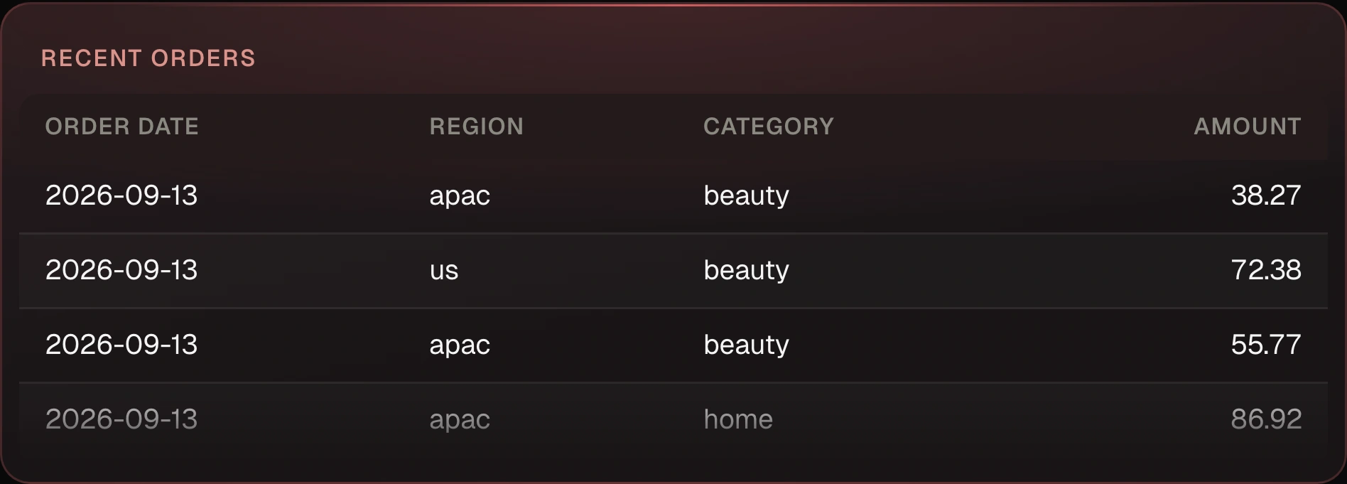
A table shows every column and row. Click a column heading to sort. It is the default
when a tile has no chart:.
- title: Recent orders
  sql: SELECT order_date, region, category, amount FROM orders ORDER BY order_date DESC LIMIT 50
Chart options
| option | charts | what it does |
|---|---|---|
type |
all | line, area, bar, scatter, pie, big_number, or table. |
x |
line, area, bar, scatter | The column on the x axis. |
y |
line, area, bar, scatter | One column or a list of columns to plot as values. |
group_by |
line, area, bar, scatter | Splits one value column into a series per distinct value of this column. |
stacked |
bar | Stacks the series instead of placing them side by side. Areas always stack. |
orientation |
bar | horizontal draws the bars sideways. |
color_by |
bar | value shades a single series by size. |
label, value |
pie | The slice label column and the size column. |
value |
big number | The column to show. |
legend |
line, area, bar, scatter, pie | false hides the legend. |
format |
all | How to format values. See Formatting below. |
chart: bar is shorthand for chart: {type: bar}. Use the long form when you want to set
any other option.
Layout
Tiles flow left to right in file order on a 12-column grid, wrapping to the next row
when a row fills up. size: sets the footprint as width by height, so 6x4 is half the
width and four rows tall. A tile without a size is 6x4.
tiles:
  - {title: Revenue, metric: revenue, size: 3x2}
  - {title: Orders, metric: order_count, size: 3x2}
  - {title: Revenue by day, metric: {name: revenue, grain: day}, chart: area, size: 6x2}
When you drag or resize a tile in the browser, sqldash writes an exact
position: {x, y, w, h} for it and leaves every other line alone, so the diff stays
small. Tiles with a position stay exactly where they are, and tiles without one flow in
file order below them.
layout: {row_height: 84} changes the height of one grid row.
Edit in the browser
Every change you make in the browser is written back to the YAML file, so it shows up as an ordinary diff you can review.
+ Explore in the top bar is where new tiles come from. It opens the query workspace, where you write SQL or pick a metric, look at the result, chart it, and click Add to dashboard. See Explore.
Edit changes the dashboard in place. You can drag and resize tiles, add or remove filters, and delete tiles. The pencil on a tile opens it in the tile editor, where you change its SQL, text, or metric, its dimensions and grain, and its chart type, run it to preview, and click Save tile. For changes you would rather describe than click, use AI Studio.
Filters
Filters are the controls at the top of a dashboard. Each one has a name, a type, and
an optional label and default. Queries read a filter’s value with {{ name }}.
filters:
  - {name: dates, type: daterange, label: Period, default: last_30_days}
  - {name: region, type: select, label: Region, options: [us, eu, apac]}
  - {name: channel, type: select, options_sql: "SELECT DISTINCT channel FROM orders"}
  - {name: min_amount, type: number, label: Minimum order, default: 0}
  - {name: customer, type: text, label: Customer email}
  - {name: as_of, type: date, label: As of, default: today}
| type | what it is |
|---|---|
daterange |
A start and end date. A filter named dates gives queries {{ dates_ and {{ dates_. |
date |
A single date. |
select |
A dropdown. Takes a fixed options list, or options_sql to load choices from a query, which also adds an all choice. |
number |
A number input. |
text |
A free text input. This is the type when you leave type out. |
Filters also apply to metric tiles. A filter whose name matches one of the metric’s
dimensions filters that dimension, and a daterange becomes the metric’s time range.
Using filter values in SQL
{{ name }} is always sent to the database as a query parameter, never pasted into the
SQL text, so a filter value can never change the query itself.
Write the placeholder unquoted, as in region = {{ region }}. A quoted
'{{ region }}' is refused by name, because a bound value cannot reach inside a string
literal and sqldash will not paste text into one. For a LIKE pattern, build the
pattern in SQL, as in name LIKE '%' || {{ search }} || '%'.
When a filter has no value, wrap the condition in {% if name %}…{% endif %} and it
drops out of the query. A select sitting on all counts as no value.
SELECT category, SUM(amount) AS revenue
FROM orders
WHERE order_date BETWEEN {{ dates_start }} AND {{ dates_end }}
  {% if region %}AND region = {{ region }}{% endif %}
  {% if min_amount %}AND amount >= {{ min_amount }}{% endif %}
GROUP BY 1
A block can also have {% elif other %} branches and an {% else %} fallback. The
first branch whose filter has a value wins, {% else %} runs when none do, and every
branch binds its own values the same way.
{% if region %}SELECT * FROM orders WHERE region = {{ region }}
{% elif country %}SELECT * FROM orders WHERE country = {{ country }}
{% else %}SELECT * FROM orders{% endif %}
The condition is always a bare filter name. Comparisons, not, a block inside another
block, loops, and every other Jinja tag are refused by name before the warehouse sees
the query, on purpose, so the SQL stays readable and safe.
Dates
Anywhere a date goes, you can write an ISO date like 2026-08-01 or a relative token.
| token | means |
|---|---|
today |
Today. |
-30d, -4w, -6m, -1y |
That many days, weeks, months, or years back. |
last_30_days |
The same as -30d. |
mtd, ytd |
The start of this month or this year. |
A token names a window, and it resolves to the edge of that window that fits where you
use it. As a start, -30d means 30 days ago. As an end, it means today. To end a range
in the past, use an ISO date.
Tokens resolve against the date on the machine running sqldash, never the viewer’s laptop, so a tile, the CLI, and MCP all run the same window for the same token.
Period comparison
Add compare: to a metric tile to show how the current window compares with an earlier
one.
- title: Revenue
  metric: revenue
  compare: previous_period
- title: Revenue by day
  metric: {name: revenue, grain: day}
  chart: line
  compare: yoy
previous_period compares with the window of the same length just before, and yoy
compares with the same window a year earlier. Big numbers show the change with an arrow,
and time series draw the earlier window as a dashed line. The earlier window is the
dashboard’s date range shifted back, so the dashboard needs a daterange filter. Without
one, sqldash lint reports an error and the tile shows it instead of a number with no
change. The same comparison works in
sqldash metric query --compare and in the MCP query_metric tool, with no SQL to write.
Formatting
format: controls how numbers display. It takes number, currency, percent,
compact, date, or any ISO 4217 currency code such as EUR.
currency: EUR
locale: de-DE

tiles:
  - {title: Revenue, metric: revenue, format: currency}
  - title: Orders by region
    sql: SELECT region, SUM(amount) AS revenue, COUNT(*) AS orders FROM orders GROUP BY 1
    format: {revenue: currency, orders: compact}
format: currency uses the dashboard’s currency:, which defaults to USD. A mapping
formats each column separately. locale: sets separators and date style for everyone,
overriding the viewer’s browser. A metric’s format: in metrics.yaml carries over to
its tiles automatically.
Validate before you commit
sqldash lint            # checks every dashboard, metric, and agent
sqldash lint --strict   # also probes the warehouse and fails on warnings, for CI
Lint catches unknown keys, missing metrics and dimensions, broken filter references,
plaintext secrets, and missing drivers, so a broken dashboard fails the pull request
instead of the page. Plain lint never opens a warehouse. --strict does, and runs
every metrics.yaml metric and every agent SQL tool wrapped in WHERE 1 = 0, so an expression or column the
warehouse cannot resolve fails CI with the warehouse’s own error and no rows come back.